Modern and contextual
Bell Buttrum Ltd
Gudjon T. Erlendsson
2017
London Extension
Material Tectonics
For Scandinavian feeling of home
A single storey extension to the rear and side of a London terrace house.
Existing property
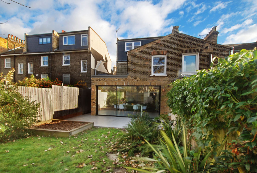
The property is a typical 19th century Victorian terrace house made from London Stock brick. With white bay windows at the front and white framed windows at the back. It has a slate roof with a back of house roof dormer extension. Behind the house is a garden of good size and fenced in on both sides with timber fencing.
Design
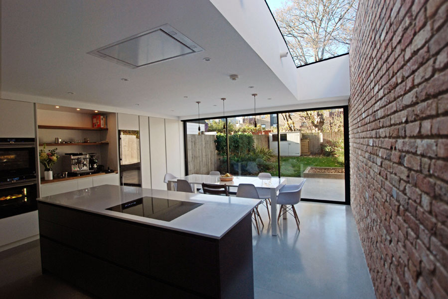
The proposal entails the extension of the existing home into the garden with a single back of house extension. Above the extension there is a skylights to bringing natural light deeper into the spaces.
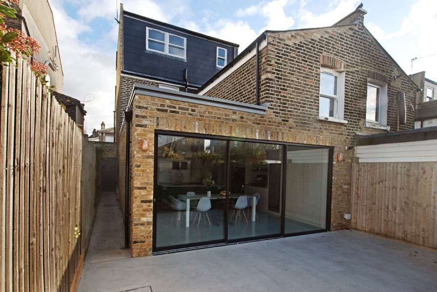
The design takes account of the scale and materials of the original building. It effectively works with these to create an addition that is contemporary in its detailing. Yet complimentary to the Victorian architecture. Accordingly the new extension is fully integrated into the building. Being flush with the gable wall of the house as well as the rear facing kitchen wall.
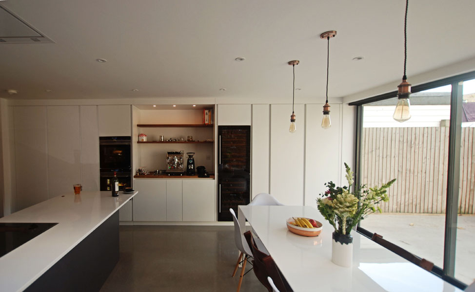
The extension allows for a larger kitchen and more spacious ground floor in keeping with a contemporary family home giving this home a much needed family space.
Appearance
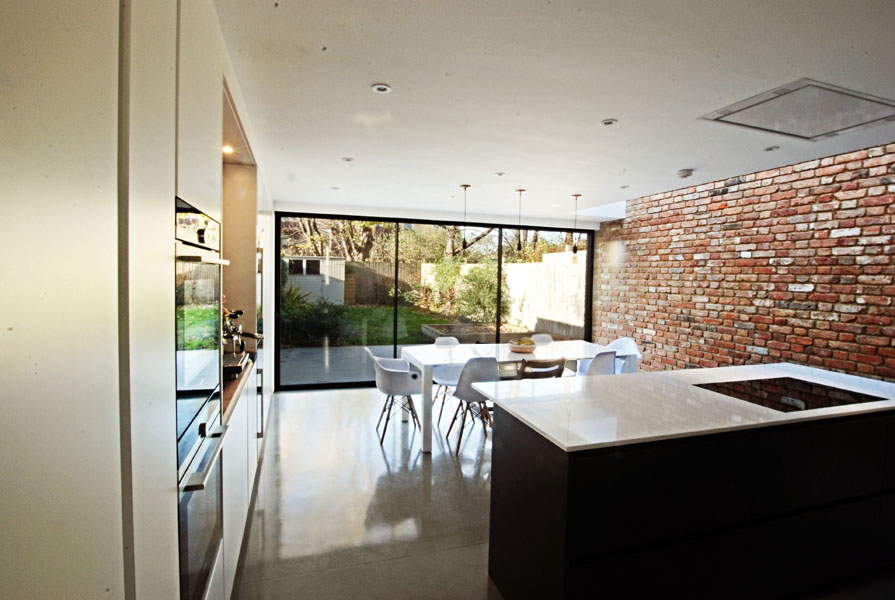
The new extension walls are London stock brick to match the main house. This works in conjunction with and compliment the high quality brickwork of the original building. This new structure has a flat roof with a skylight to bring light into the large open space internally. To the rear are sliding/folding doors to open into the garden with a new paved patio area immediately by the opening. The skylight was then designed with minimal detailing to look like a natural opening between the new structure and main house.
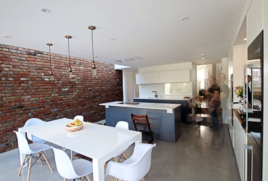
The alterations provide a large open plan kitchen and dining room with a new down-stairs WC and utility room. These service spaces form a block separating the Living room at the front of house from the new kitchen/diner at the garden side.
Internal materials are minimal and a mixture of modern and classical palette to seamlessly merge into the existing. These play with both colour and texture. And range from natural to very man made. This manages to match the palette with combined smooth and soft contemporary materials to create a balance of the cool and the hyggelig.
